BY ADORA HOMES
How Color Psychology Shapes Interior Design and Ambience
How Color Psychology Shapes Interior Design and Ambience
In interior design, color transcends mere decoration—it's a subtle architect of emotion, behavior, and well-being. Imagine entering a room that instantly invigorates you or one that wraps you in quiet comfort. This is color psychology in action, a field blending science and art to craft spaces that resonate on a visceral level. From boosting productivity to easing stress, hues influence our daily lives profoundly. As we navigate modern living—blending work, rest, and play—mastering color can elevate homes from functional to transformative. This exploration unpacks color psychology's foundations, spotlights key hues and their emotional pulls, and offers actionable strategies for your spaces. Whether refreshing a tired corner or overhauling a room, these insights empower intentional design. Let's illuminate how colors can harmonize your environment.
The Foundations of Color Psychology
At its core, color psychology examines how wavelengths of light—perceived as hues—trigger responses in the brain. Backed by neuroscience and environmental studies, it reveals colors' power over physiology: reds accelerate heart rates, blues slow them. Pioneers like Johann Wolfgang von Goethe in his 1810 "Theory of Colours" laid early groundwork, while contemporary research, such as from the Journal of Environmental Psychology, links specific shades to mood shifts. In design, this science informs ambience. A kitchen's warm tones might stimulate appetite, while a bedroom's cools promote sleep. Experts like interior icon Kelly Wearstler emphasize color as "emotional shorthand," dictating a space's narrative. Poor choices? They can drain energy or heighten tension. Thoughtful application, however, fosters balance, turning houses into mood-aligned havens.
Decoding the Emotional Spectrum
Colors evoke universal yet nuanced feelings, shaped by biology and culture. Here's a curated guide to interior staples:
Red: Igniting Passion and Vitality
Red commands attention, evoking excitement and urgency. It elevates energy, making it ideal for dining nooks or workout zones where stimulation counts. A ruby accent wall in a kitchen can invigorate gatherings, even enhancing flavor perception per appetite studies. Yet, excess red breeds agitation—think racing pulses. Temper it with neutrals: charcoal rugs or ivory linens. In accents like velvet cushions, it adds warmth without dominance, perfect for transitional spaces.
Blue: Harbor of Tranquility
Blue whispers calm, mimicking skies and seas to lower cortisol and soothe nerves. Hospitals favor it for waiting areas; at home, it's a bedroom boon, expanding perceived space with airy cerulean walls. Deeper indigos suit contemplative libraries, but pair with brass fixtures to avoid sterility. Its versatility shines in bathrooms, blending with marble for spa serenity.
Green: Embrace of Renewal
Nature's hue, green restores equilibrium, easing eye strain and sparking creativity. Offices thrive on sage greens, fostering focus amid foliage-inspired patterns. A verdant headboard invites renewal in bedrooms, grounding urban dwellers. From olive for earthy minimalism to chartreuse for whimsy, it adapts. Layer with terracotta for organic flow, ideal in living areas craving balance.
Yellow: Burst of Optimism
Sunlit yellow radiates joy, sharpening cognition and banishing blues. Entryways glow with it, welcoming positivity; studies link it to heightened alertness in studies. Opt for buttery shades over neon to sidestep fatigue. In nurseries, pale lemon walls with gray textiles create playful yet restful vibes.
Purple: Veil of Mystery and Luxury
Melding red's fire and blue's peace, purple stirs imagination and introspection. Lavish lounges benefit from amethyst drapes, evoking regal depth. Lighter lilacs soften for creative studios; richer violets demand gold accents to prevent gloom. It's a wildcard for accents, adding intrigue to neutrals.
Neutrals: The Steady Canvas
Grays convey sleek modernity but risk coldness—warm them with textures like wool. Beiges anchor coziness in family rooms, whites amplify light in compacts. As backdrops, they amplify bolder elements, ensuring harmony.
Tailoring Colors to Spaces
Apply psychology room-specifically for potency. Living rooms? Taupe bases with coral pops encourage sociability. Bedrooms demand azure or mint for repose, enhanced by soft lighting. Kitchens pulse with ochre cabinets, reds in tiles for culinary zest. Offices blend teal walls and amber lamps for sustained concentration. Adhere to the 60-30-10 rule: 60% walls in primaries, 30% furnishings in secondaries, 10% accents. Daylight tests are crucial—hues morph under lamps.
Cultural Layers and Personalization
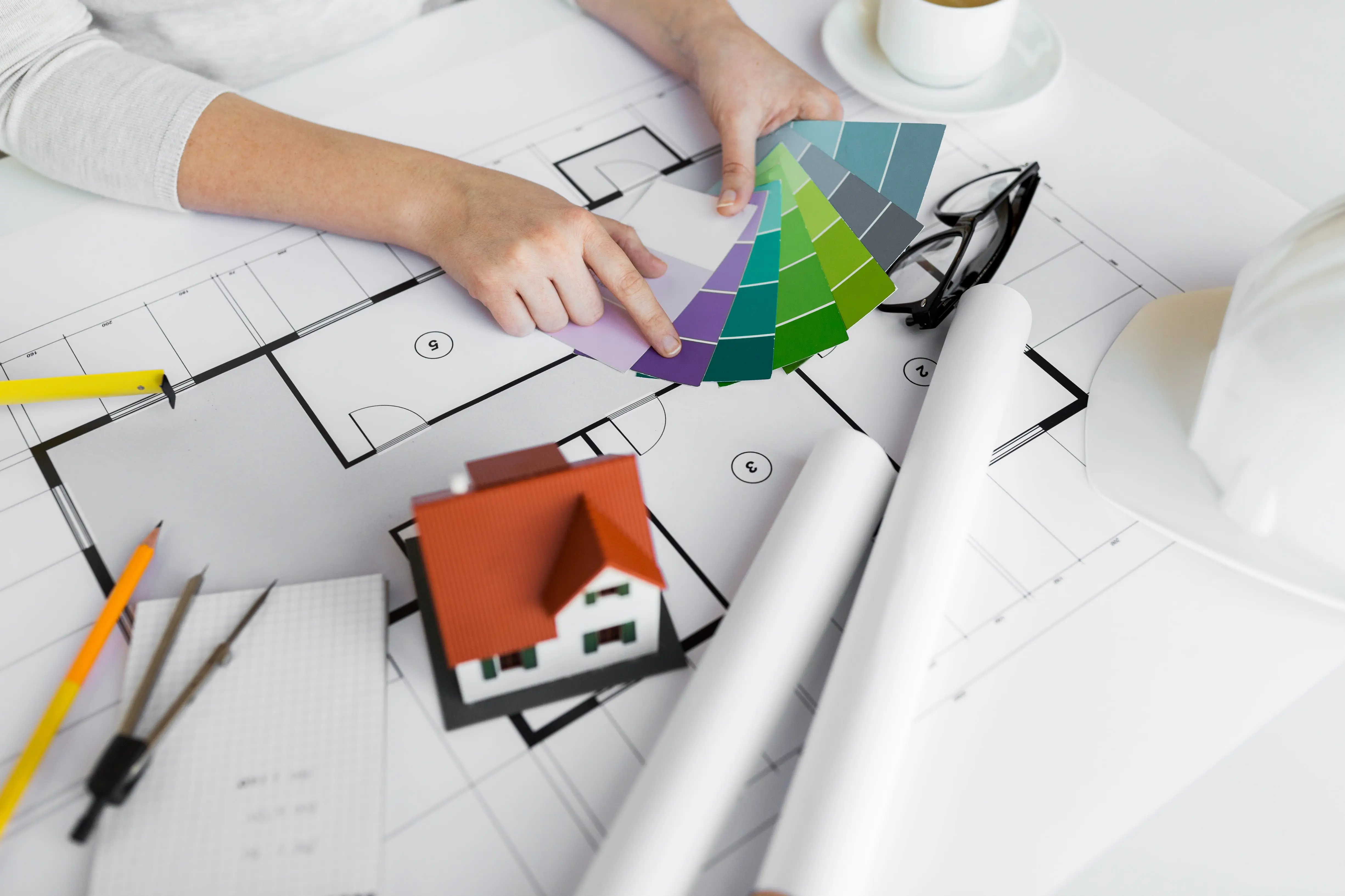
Psychology varies globally: white purity in the West signals mourning in Asia; red luck in China flags peril elsewhere. Honor your heritage—blue for a seaside nostalgia? Tools like Pantone swatches or Canva palettes aid curation. Consult intuitives if needed, blending data with desire.
Conclusion: Hue Your World Mindfully
Color psychology demystifies design, arming you to sculpt ambiences that nurture. It's not formulaic but fluid, inviting experimentation for spaces that energize, heal, and inspire.


.jpg)
